Rundfunkchor Berlin
2024/2025
Client
Client
Rundfunkchor Berlin
Rundfunkchor Berlin
SECTOR
SECTOR
Art & Culture
Art & Culture
SERVICE
SERVICE
Creative Direction, Campaign, Editorial Design
Creative Direction, Campaign, Editorial Design
Year
Year
2024
2024
About
About
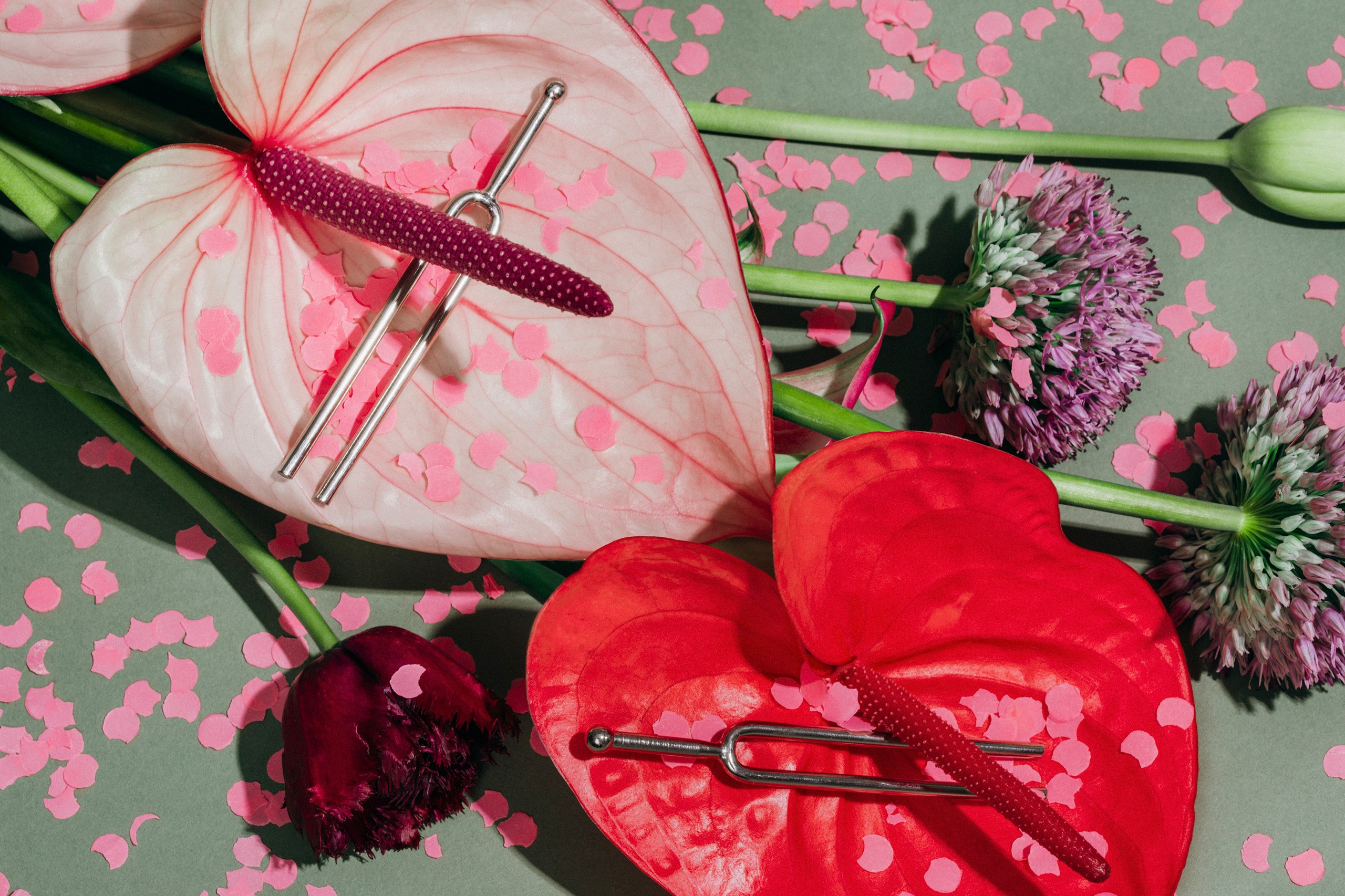
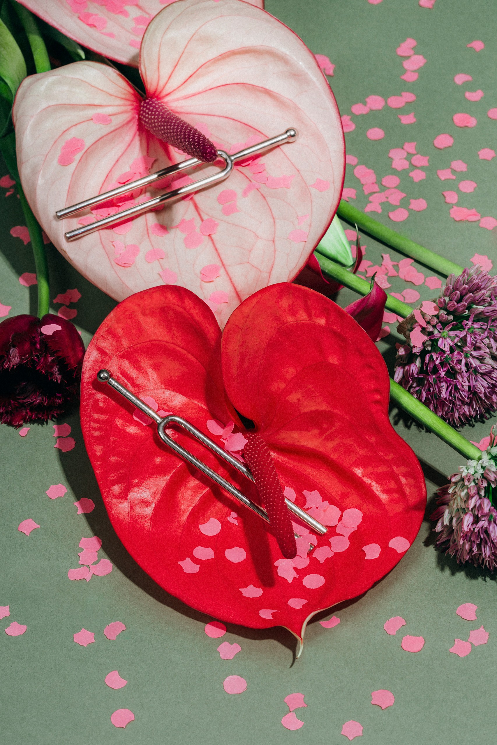
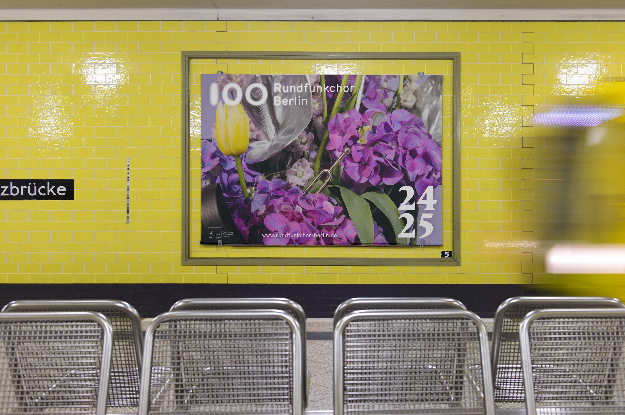
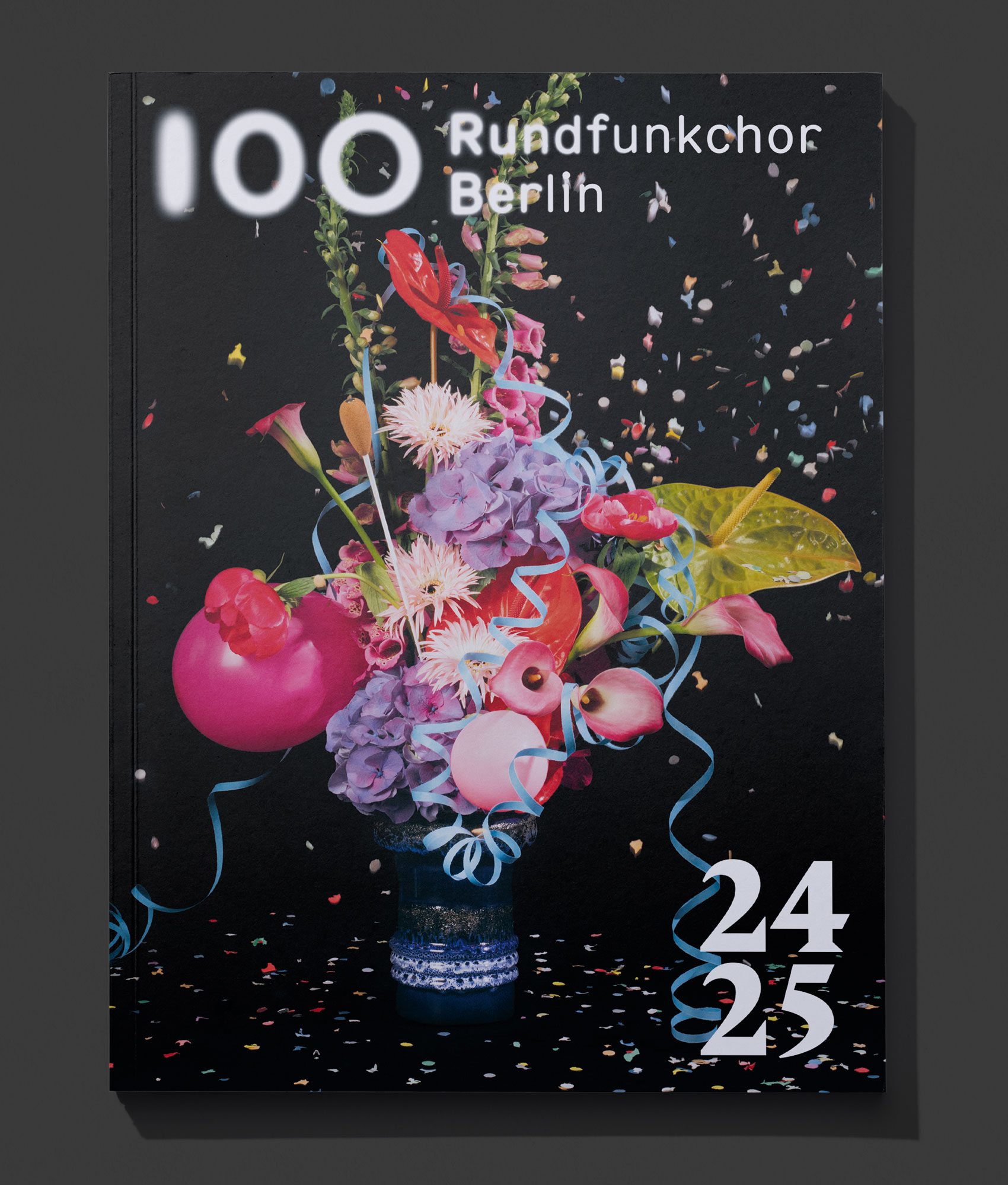
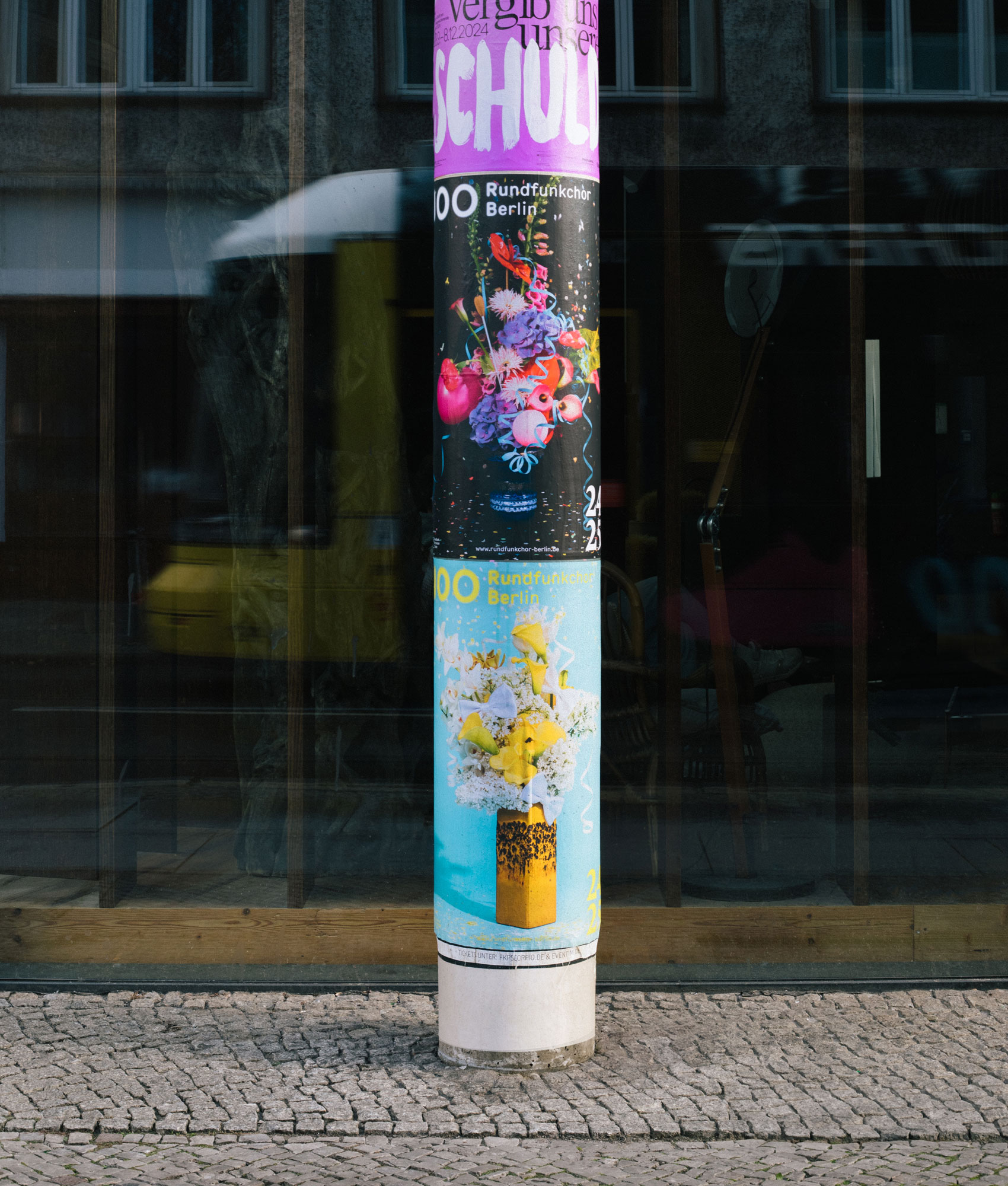
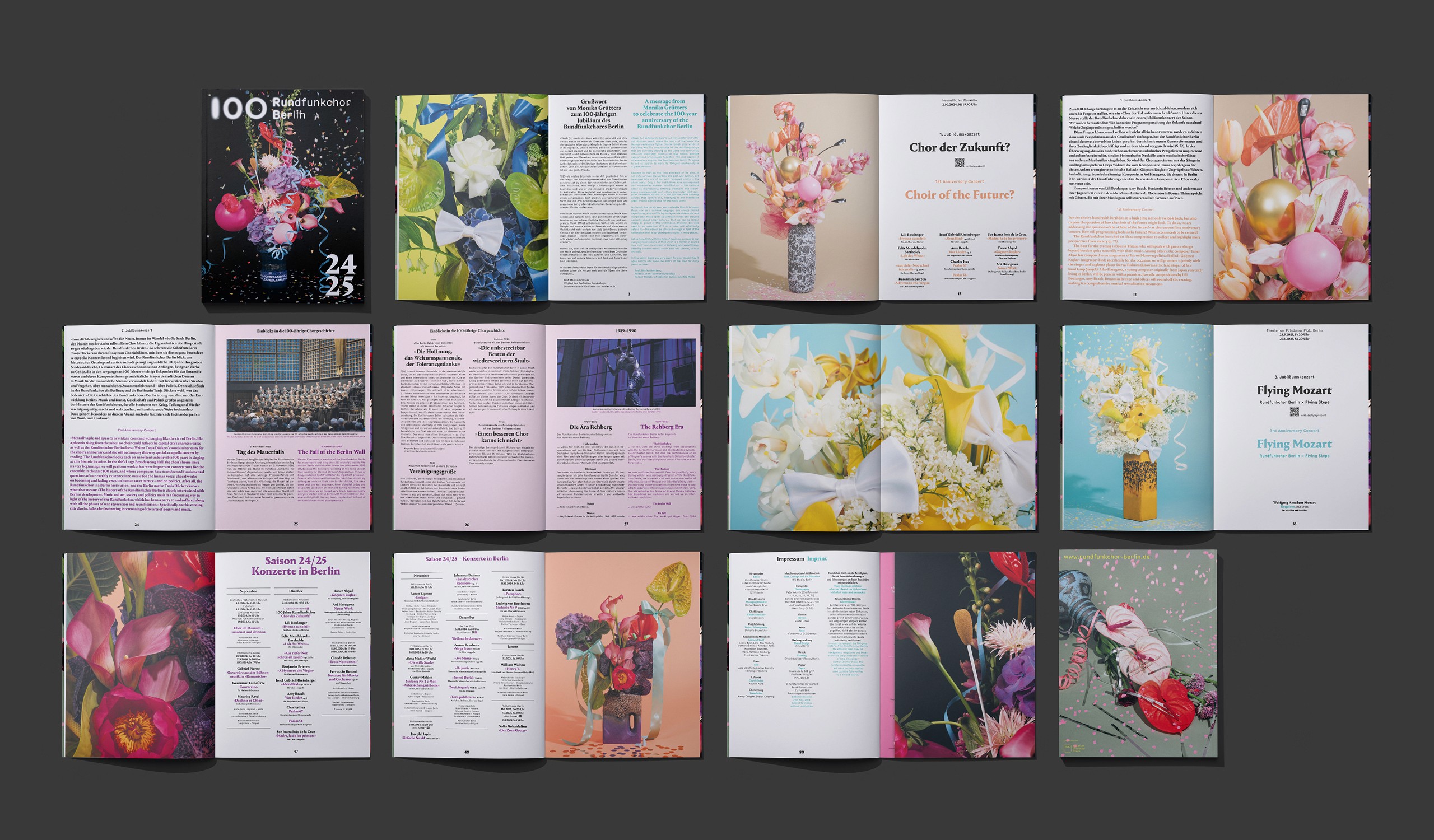
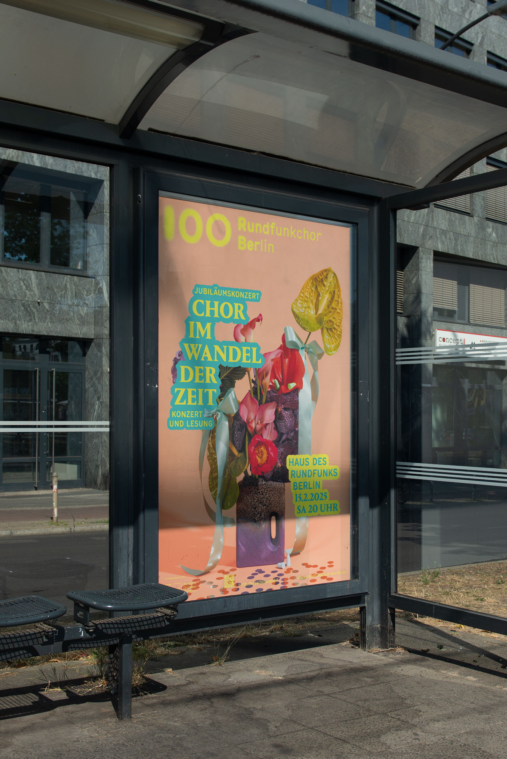
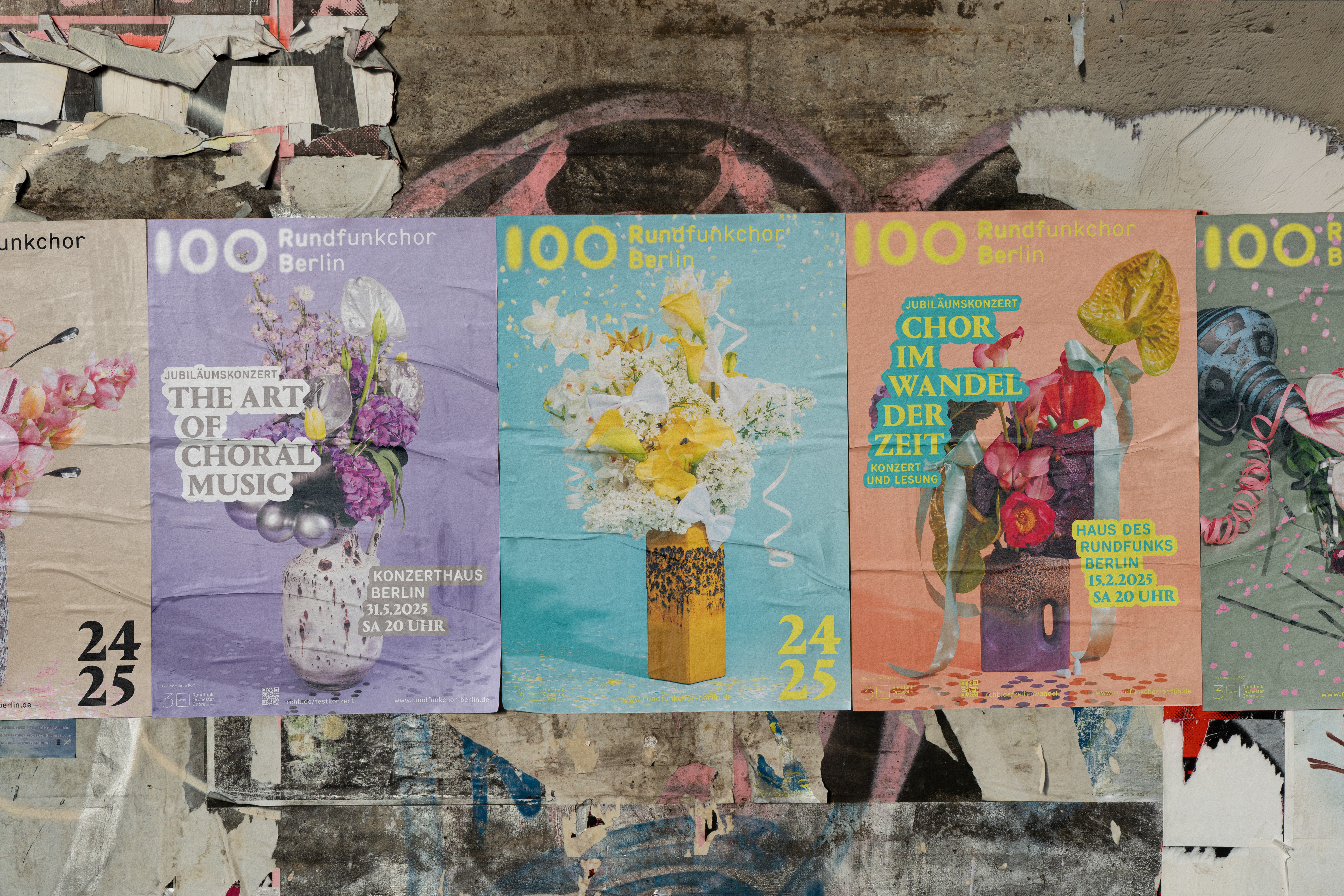
The Rundfunkchor Berlin’s 2025/26 season campaign marked a singular moment in the choir’s history: its 100th anniversary. Rather than treating the occasion as a retrospective, the campaign positions the centenary as a living, forward-looking celebration.
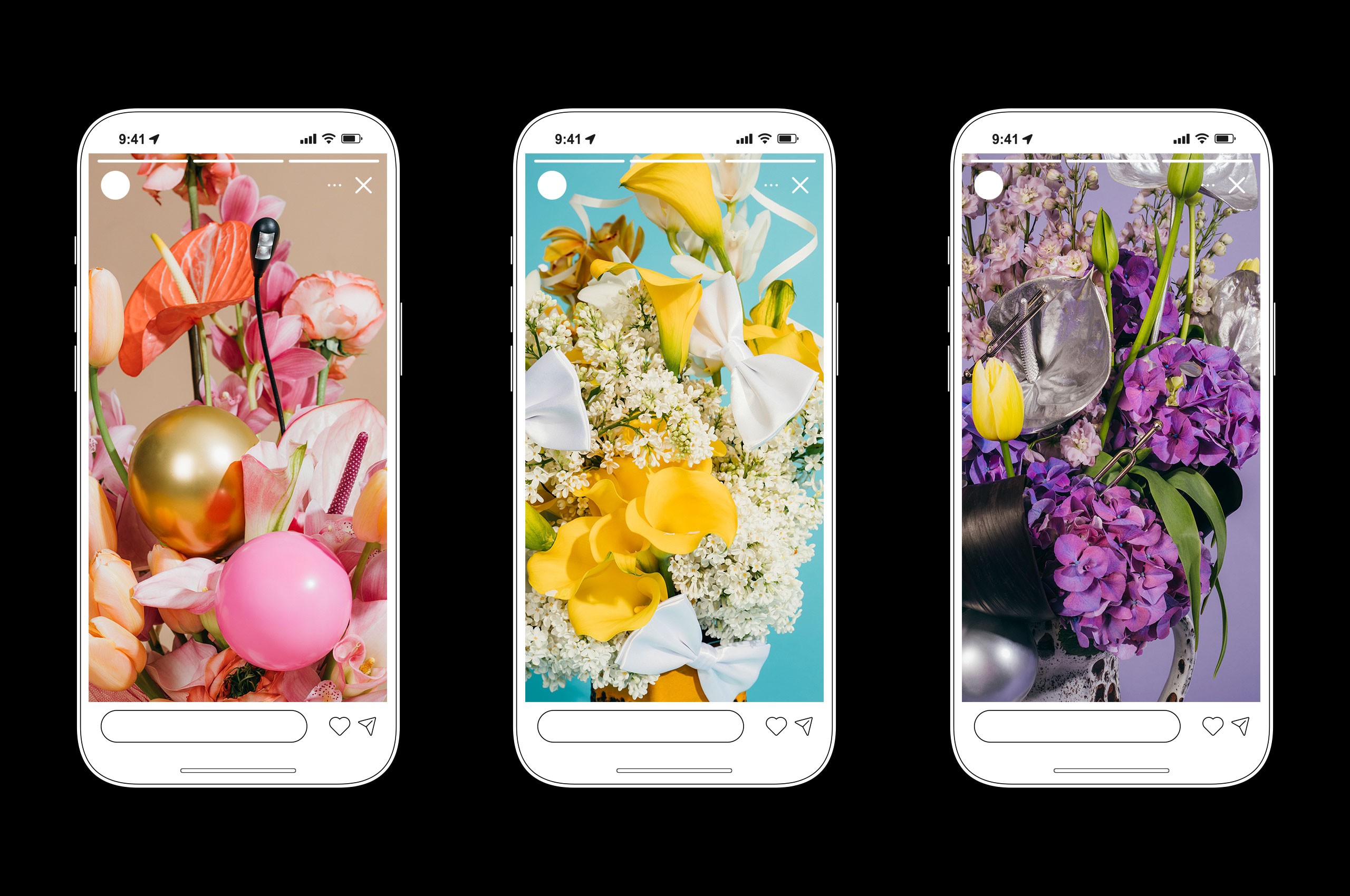
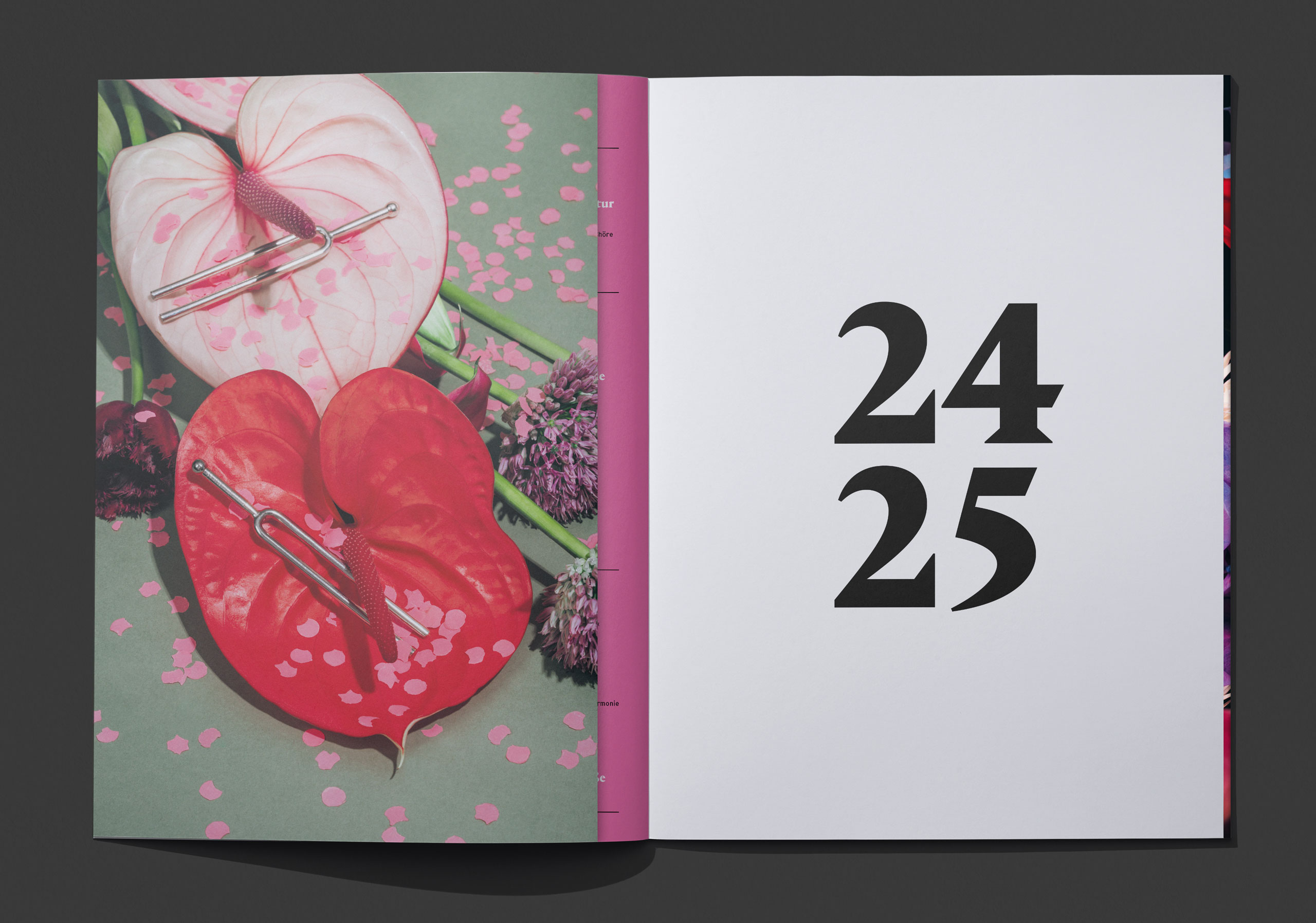
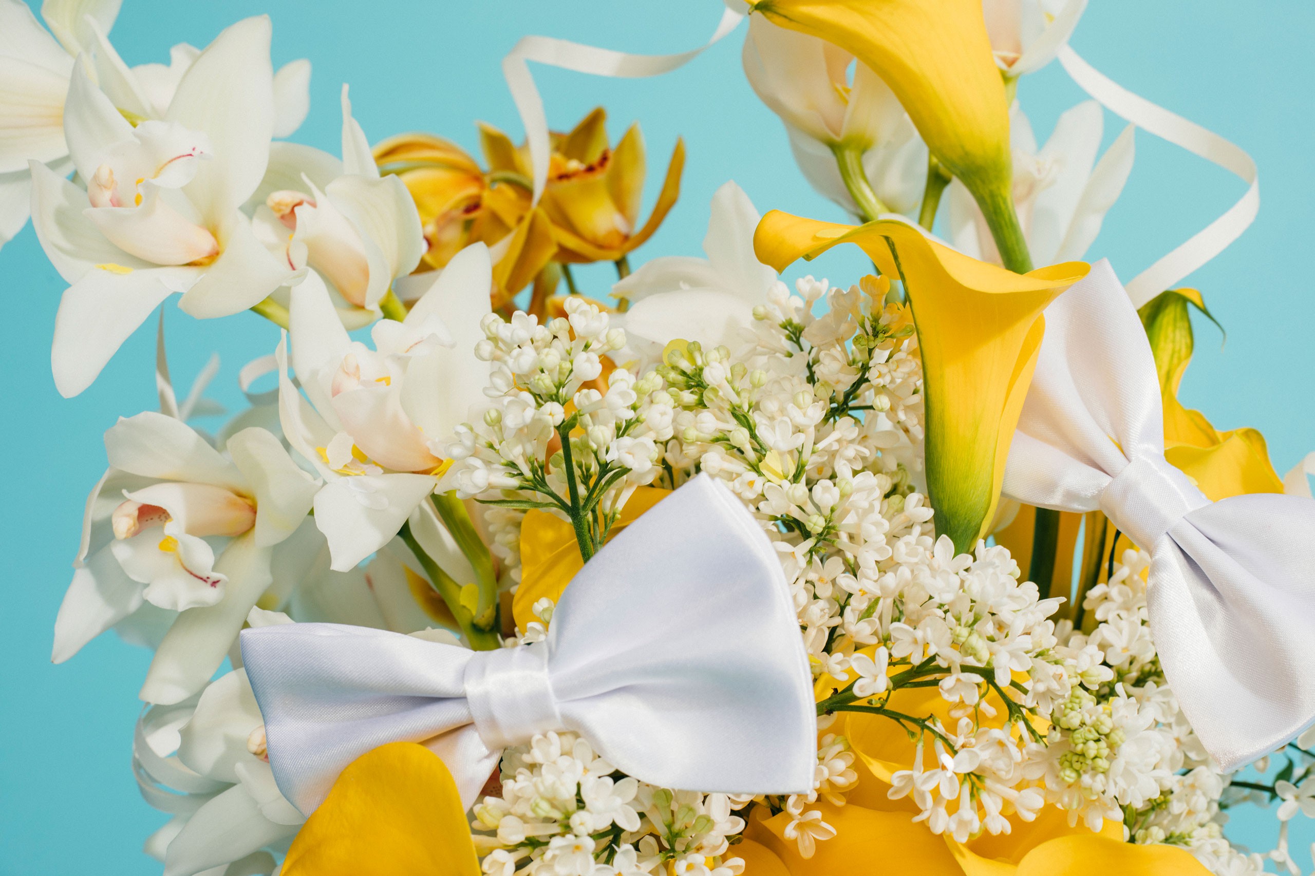
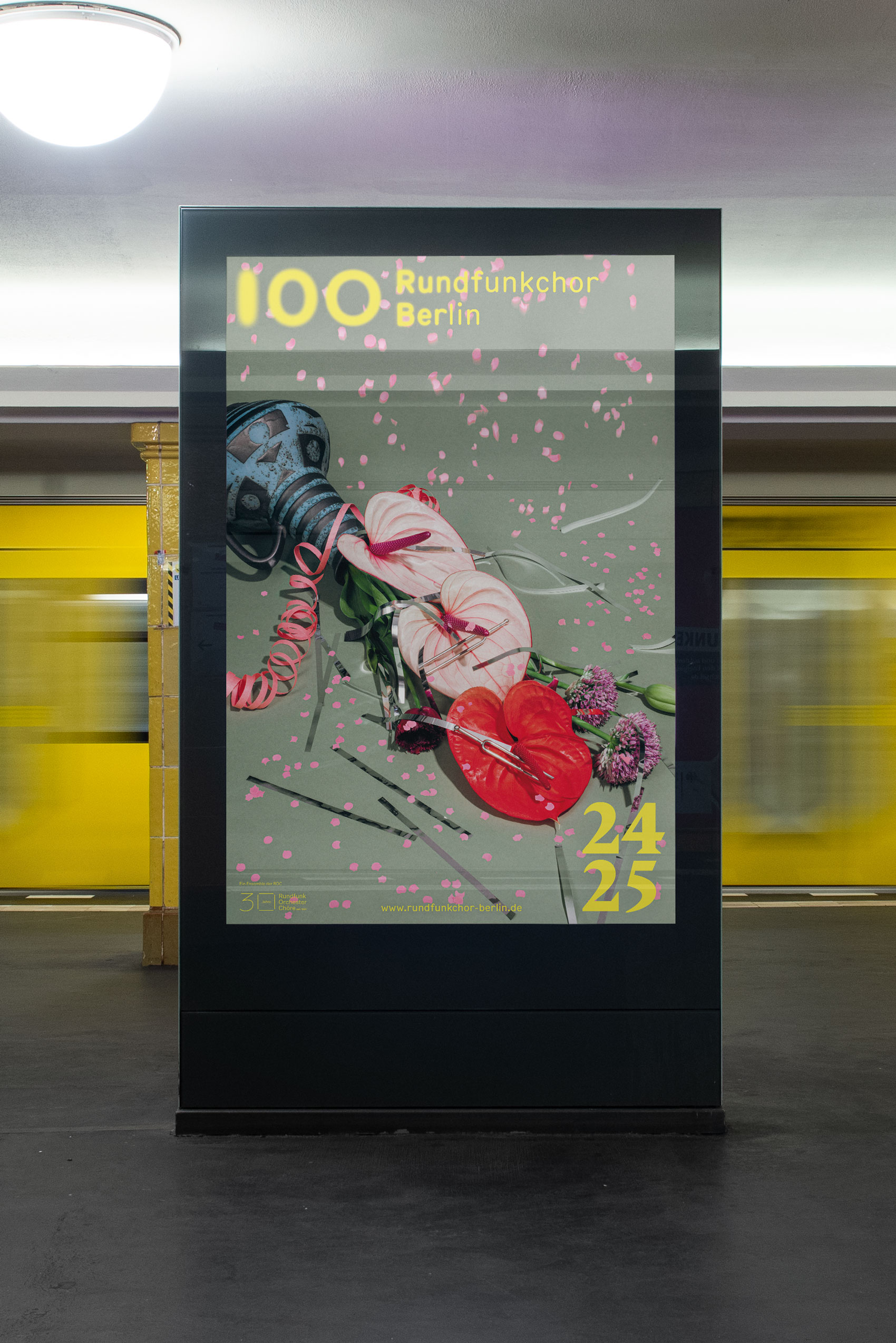
Our creative response was a visual language that embraces abundance and playfulness. A specially developed image concept combines lush floral arrangements with confetti, ribbons, and bows, interwoven with elements from the choir’s everyday practice. The color palette builds on the existing visual language of the Rundfunkchor, reinterpreted in a brighter, more vibrant, and celebratory tone.
A central element of the campaign was the extension of the existing logo. A custom-designed anniversary version adds a distinct layer to the brand — integrated with restraint, yet clearly legible as a commemorative gesture.
The resulting identity balances continuity and renewal. It honors the choir’s history while presenting it with contemporary confidence, transforming the anniversary into a visible, tangible experience. An identity designed not only to mark a milestone, but to invite audiences to celebrate, reflect, and look ahead.
The Rundfunkchor Berlin’s 2025/26 season campaign marked a singular moment in the choir’s history: its 100th anniversary. Rather than treating the occasion as a retrospective, the campaign positions the centenary as a living, forward-looking celebration.
Our creative response was a visual language that embraces abundance and playfulness. A specially developed image concept combines lush floral arrangements with confetti, ribbons, and bows, interwoven with elements from the choir’s everyday practice. The color palette builds on the existing visual language of the Rundfunkchor, reinterpreted in a brighter, more vibrant, and celebratory tone.
A central element of the campaign was the extension of the existing logo. A custom-designed anniversary version adds a distinct layer to the brand — integrated with restraint, yet clearly legible as a commemorative gesture.
The resulting identity balances continuity and renewal. It honors the choir’s history while presenting it with contemporary confidence, transforming the anniversary into a visible, tangible experience. An identity designed not only to mark a milestone, but to invite audiences to celebrate, reflect, and look ahead.


Credits
Campaign Photography
Sandra Gramm
Floral Design
Studio Linné
Credits
Campaign Photography
Sandra Gramm
Floral Design
Studio Linné

