Boards&More Group

Client
Client
Boards&More Group
Boards&More Group
SECTOR
SECTOR
Consumer Brands
Consumer Brands
SERVICE
SERVICE
Branding, Corporate Design, Type Design
Branding, Corporate Design, Type Design
Year
Year
2023
2023
About
About
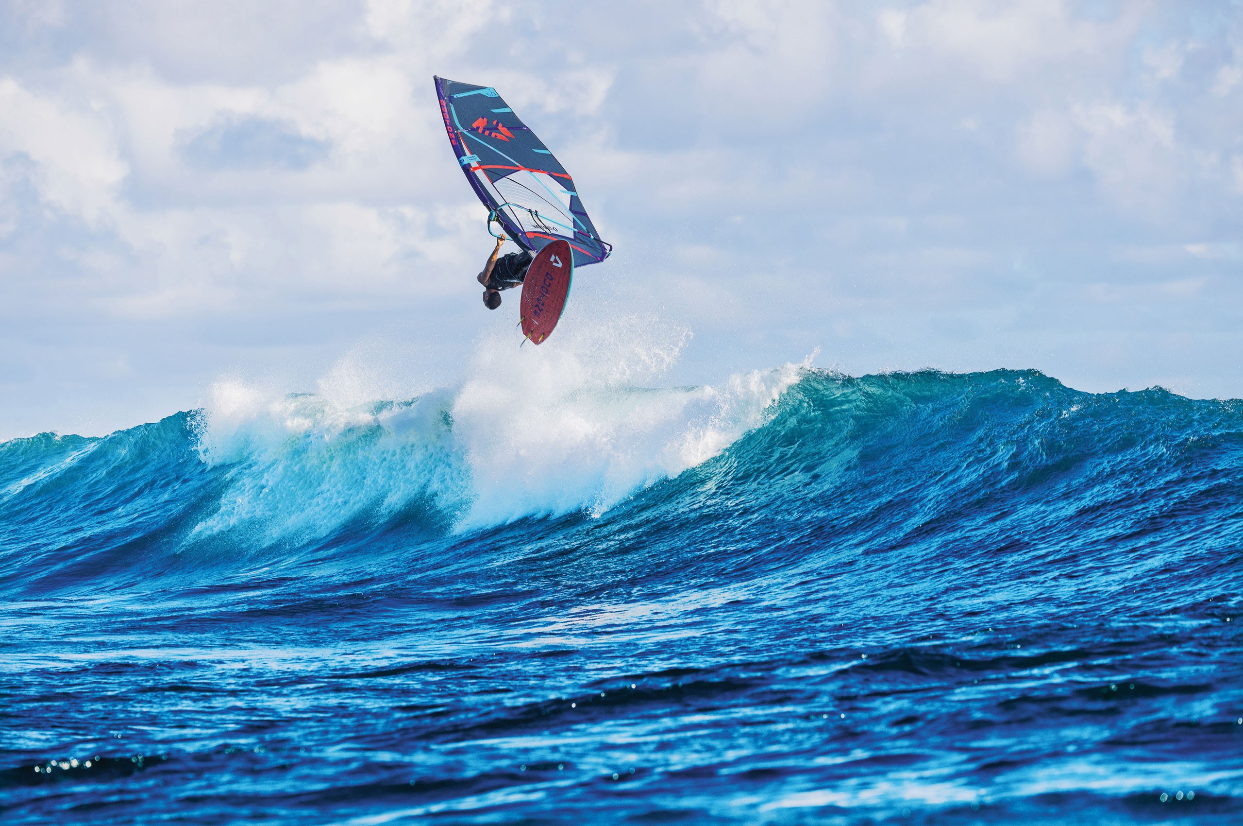
Boards & More Group brings together the brands Duotone, Fanatic, ION, SQlab, and WOO, each established in their respective sports and collectively representing global leadership in kiteboarding, windsurfing, wing & foiling, as well as strong positions in stand-up paddleboarding and mountain biking. The company’s vision is to enable athletes and enthusiasts alike to push their limits on water, in the air, or on the trails.
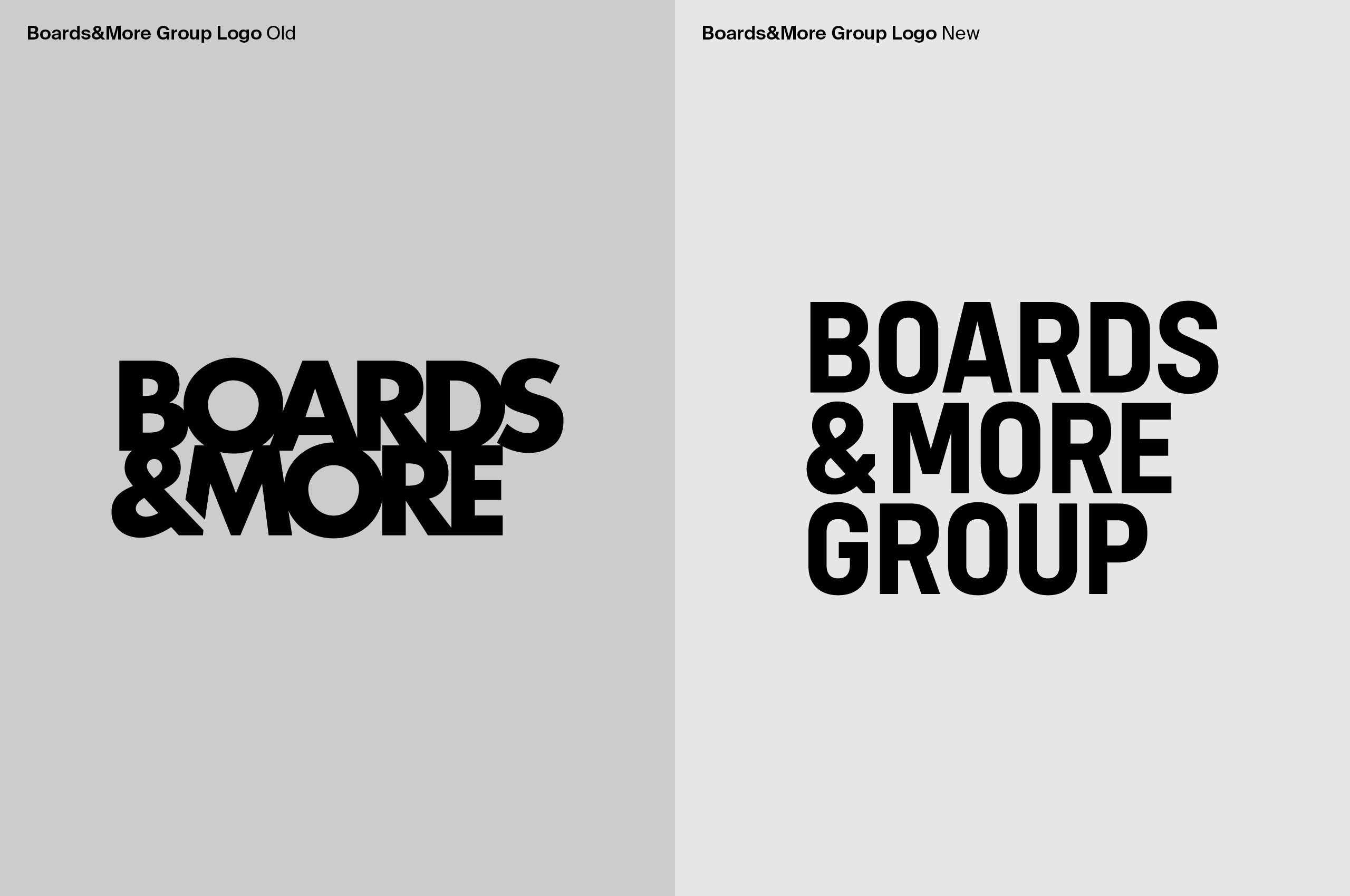
The redesign of the Boards & More wordmark focused on clarity, balance, and the integration of the new “Group” designation. We redrew the letterforms to create a compact, three-line layout that accommodates the different word lengths while maintaining an even visual weight across all letters. The ampersand was specially adjusted to harmonize with the “M” in More, ensuring fluidity and cohesion within the logotype.
By standardizing stroke widths and removing fused forms from the previous design, we increased legibility and created a more timeless, disciplined structure. The resulting wordmark reads clearly across applications while projecting the stability and professionalism of the parent company.
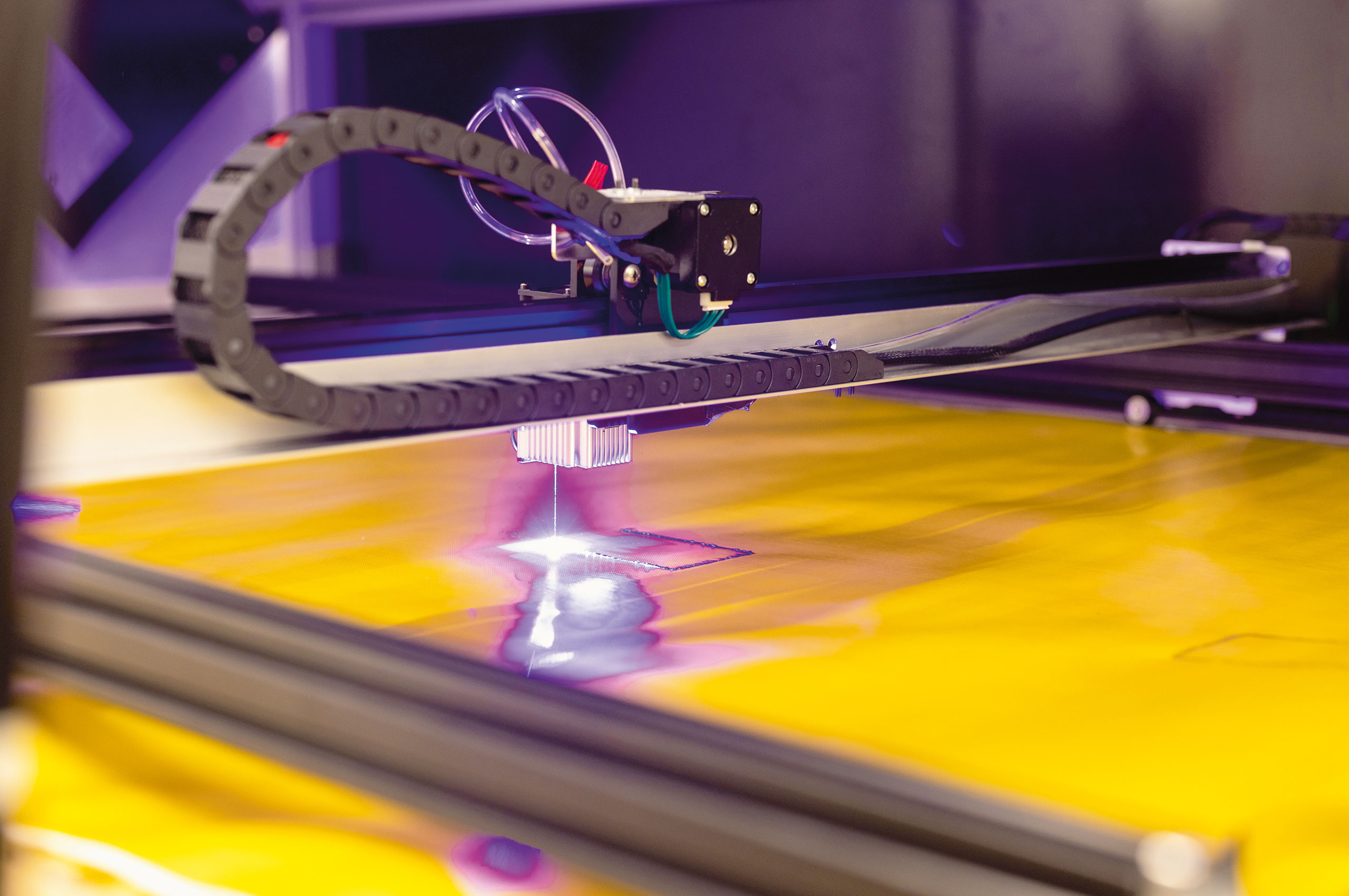
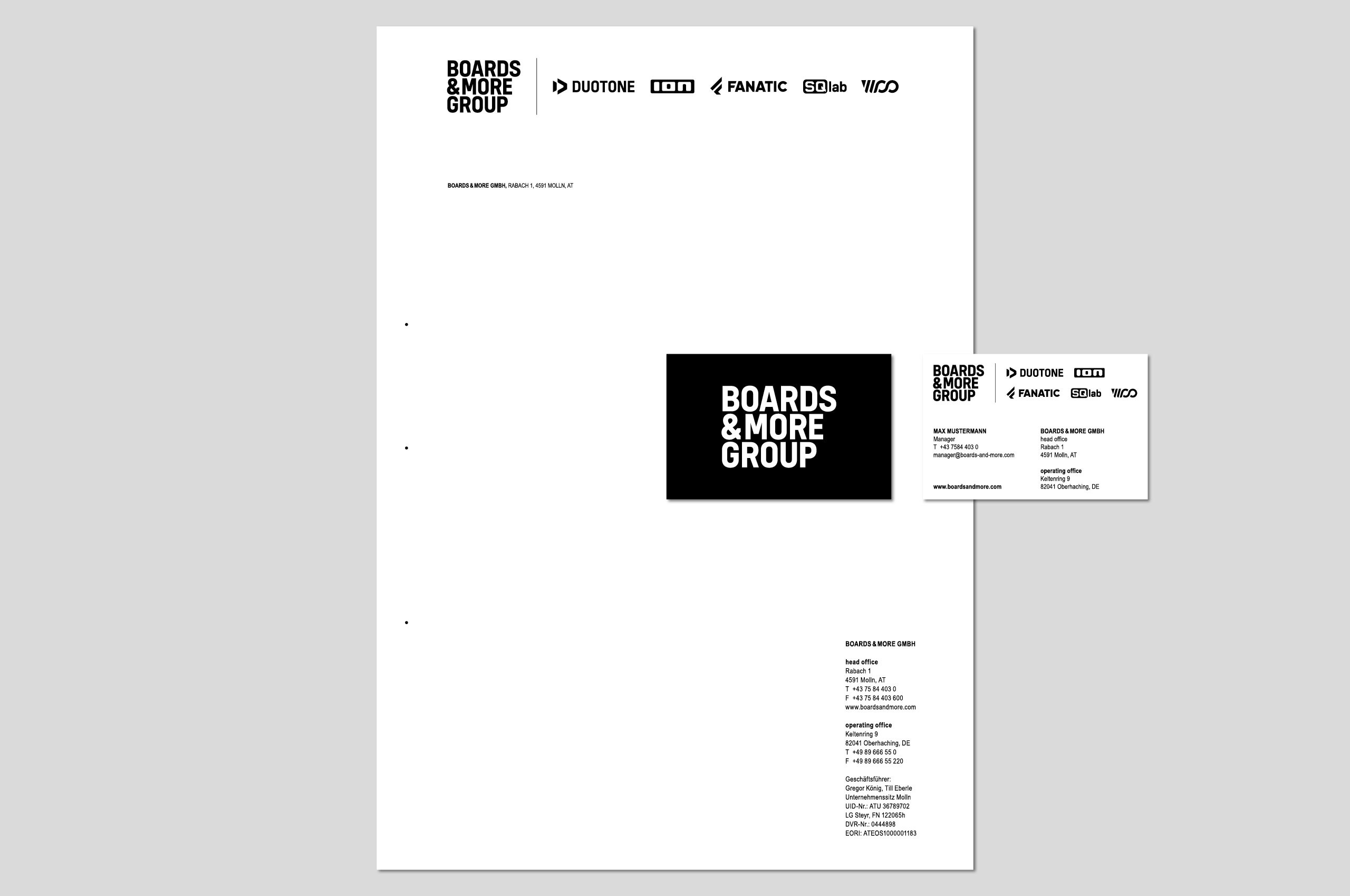
In addition to the core logo, the identity system was extended to corporate stationery, a color palette, and usage guidelines, providing a coherent framework for consistent application across all brands and communications of the Boards & More Group.
Boards & More Group brings together the brands Duotone, Fanatic, ION, SQlab, and WOO, each established in their respective sports and collectively representing global leadership in kiteboarding, windsurfing, wing & foiling, as well as strong positions in stand-up paddleboarding and mountain biking. The company’s vision is to enable athletes and enthusiasts alike to push their limits on water, in the air, or on the trails.
The redesign of the Boards & More wordmark focused on clarity, balance, and the integration of the new “Group” designation. We redrew the letterforms to create a compact, three-line layout that accommodates the different word lengths while maintaining an even visual weight across all letters. The ampersand was specially adjusted to harmonize with the “M” in More, ensuring fluidity and cohesion within the logotype.
By standardizing stroke widths and removing fused forms from the previous design, we increased legibility and created a more timeless, disciplined structure. The resulting wordmark reads clearly across applications while projecting the stability and professionalism of the parent company.
In addition to the core logo, the identity system was extended to corporate stationery, a color palette, and usage guidelines, providing a coherent framework for consistent application across all brands and communications of the Boards & More Group.


Credits
Photography
©Boards&More Group
Credits
Photography
©Boards&More Group


