Duotone


Client
Client
Duotone
Duotone
SECTOR
SECTOR
Consumer Brands
Consumer Brands
SERVICE
SERVICE
Branding, Corporate Design, Logo Design, Type Design, Guidelines
Branding, Corporate Design, Logo Design, Type Design, Guidelines
Year
Year
2018–ongoing
2018–ongoing
About
About
Duotone operates in environments defined by speed, force, and constant change. The brand addresses a performance-driven audience that demands precision, reliability, and control under real conditions.
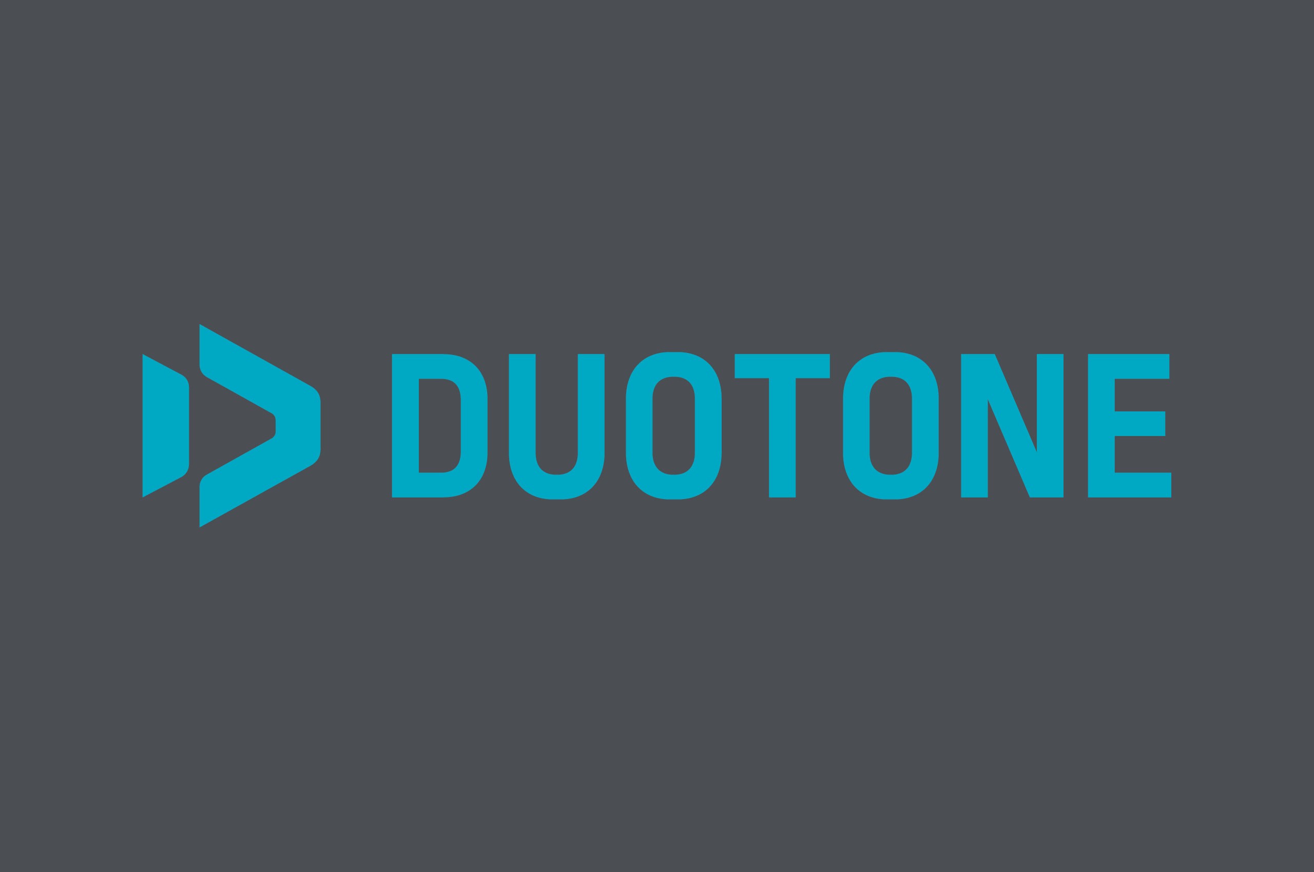
Our approach was to treat identity not as representation, but as equipment. The central brand element is built from the convergence of three references: the abstract form of a kite, the letter “D,” and a directional arrow. We condensed these into a compact, forward-driven sign designed for visibility in motion, at distance, and across unstable surfaces.
We developed a custom logotype to match this logic. Its condensed style creates a dense and controlled presence, reinforcing clarity under pressure. Symbol and type are conceived as one system, engineered for consistency across all applications.
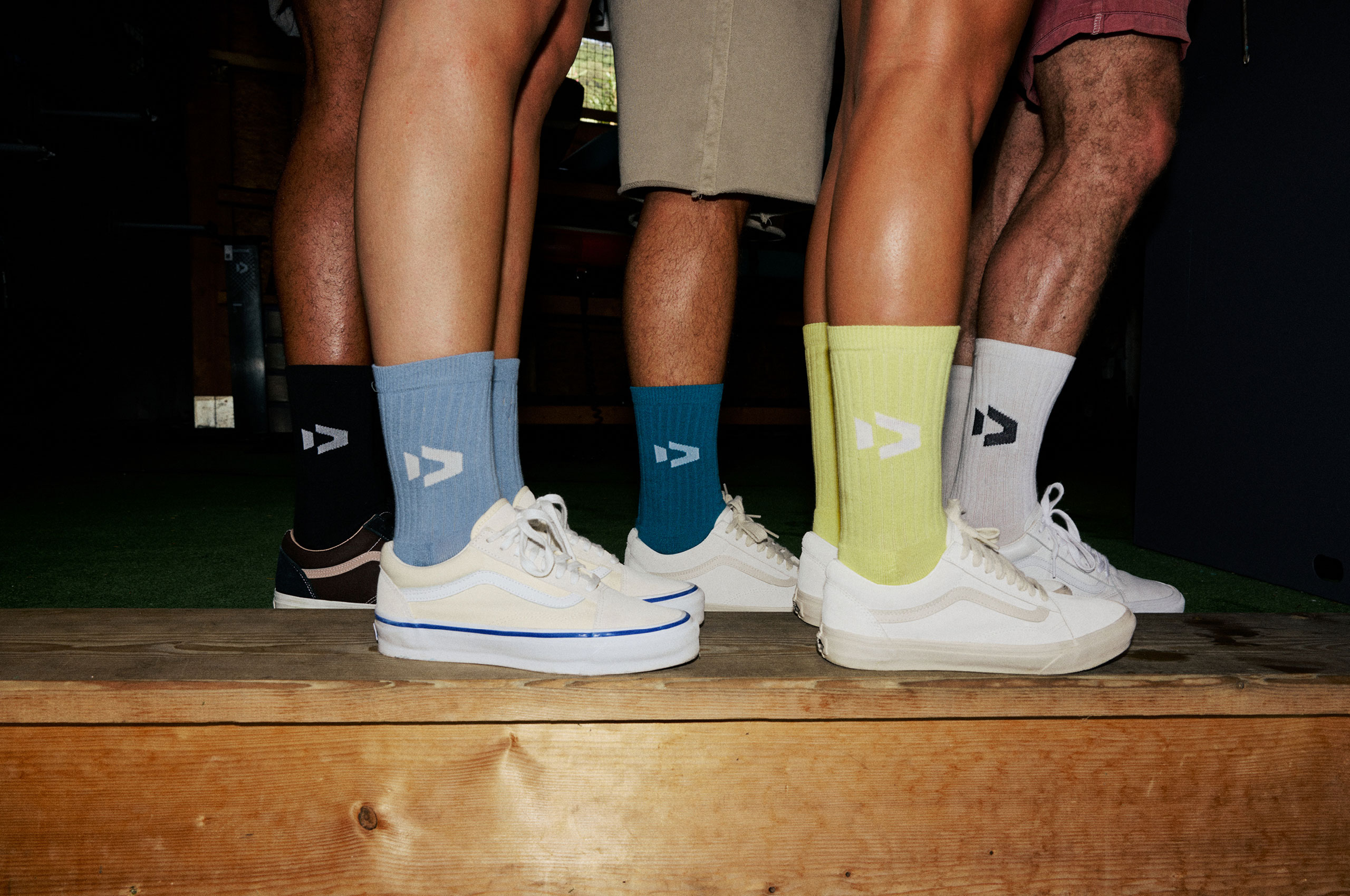
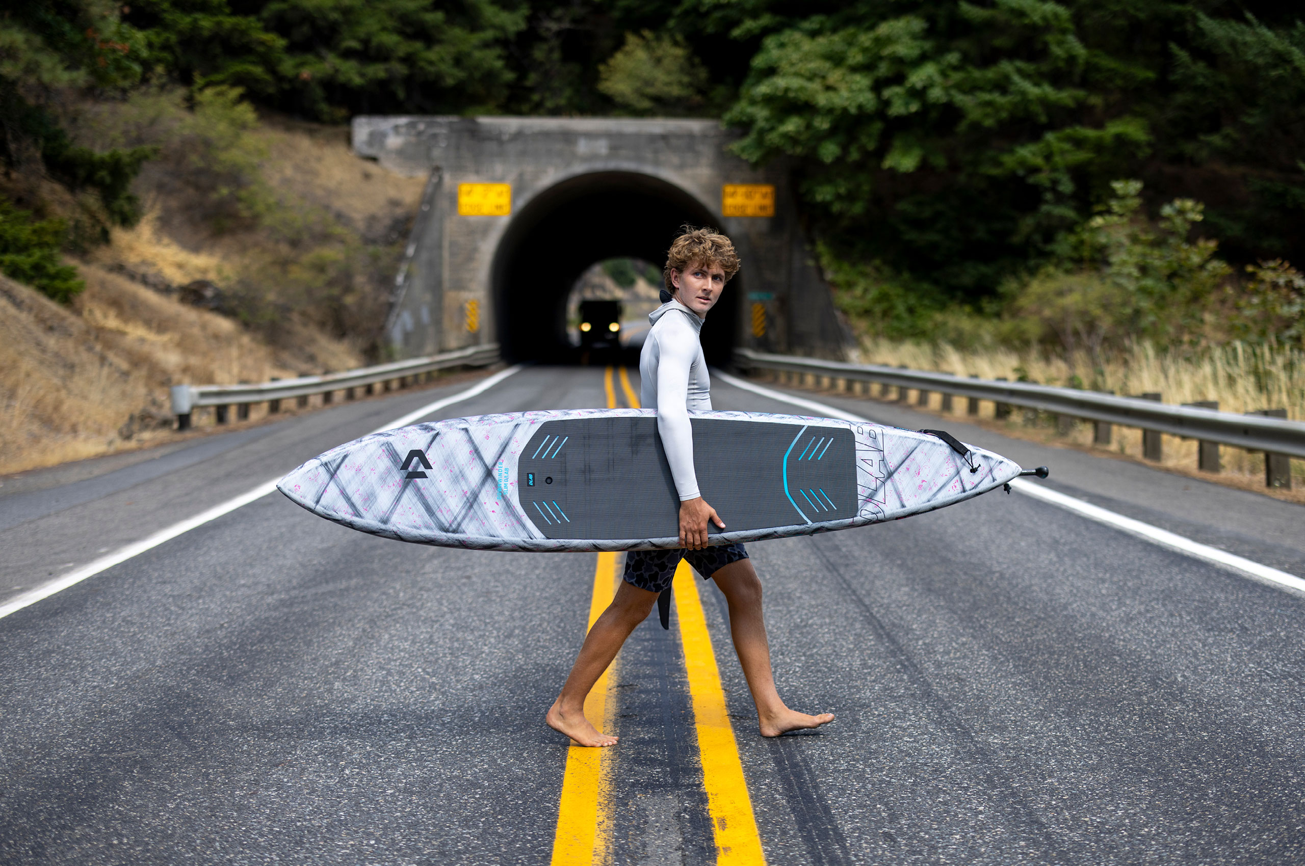
The identity extends into a comprehensive framework. Our work includes a bespoke type family, a reduced and functional color system, and clear usage principles. Applied across products, retail environments, digital interfaces, and communication, the system maintains coherence while adapting to context.
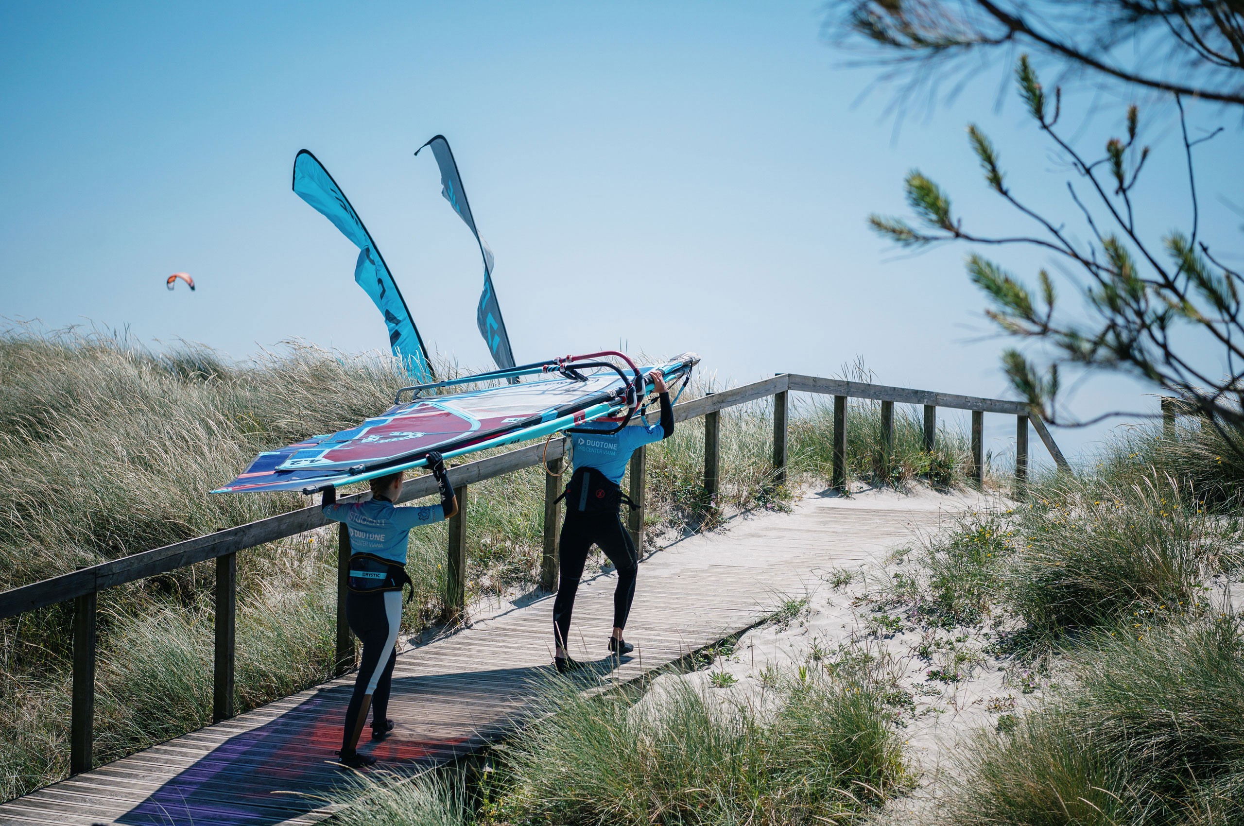
For the Duotone Pro Center, we translated the identity into a flexible sub-brand, enabling a global network of locations to operate within a shared visual language.
Duotone operates in environments defined by speed, force, and constant change. The brand addresses a performance-driven audience that demands precision, reliability, and control under real conditions.
Our approach was to treat identity not as representation, but as equipment. The central brand element is built from the convergence of three references: the abstract form of a kite, the letter “D,” and a directional arrow. We condensed these into a compact, forward-driven sign designed for visibility in motion, at distance, and across unstable surfaces.
We developed a custom logotype to match this logic. Its condensed style creates a dense and controlled presence, reinforcing clarity under pressure. Symbol and type are conceived as one system, engineered for consistency across all applications.
The identity extends into a comprehensive framework. Our work includes a bespoke type family, a reduced and functional color system, and clear usage principles. Applied across products, retail environments, digital interfaces, and communication, the system maintains coherence while adapting to context.
For the Duotone Pro Center, we translated the identity into a flexible sub-brand, enabling a global network of locations to operate within a shared visual language.


Credits
Design
Simon Thordal
Photography
©Duotone
Credits
Design
Simon Thordal
Photography
©Duotone