SQlab


Client
Client
SQlab
SQlab
SECTOR
SECTOR
Consumer Brands
Consumer Brands
SERVICE
SERVICE
Branding, Corporate Design, Logo Design, Type Design, Guidelines
Branding, Corporate Design, Logo Design, Type Design, Guidelines
Year
Year
2025
2025
About
About
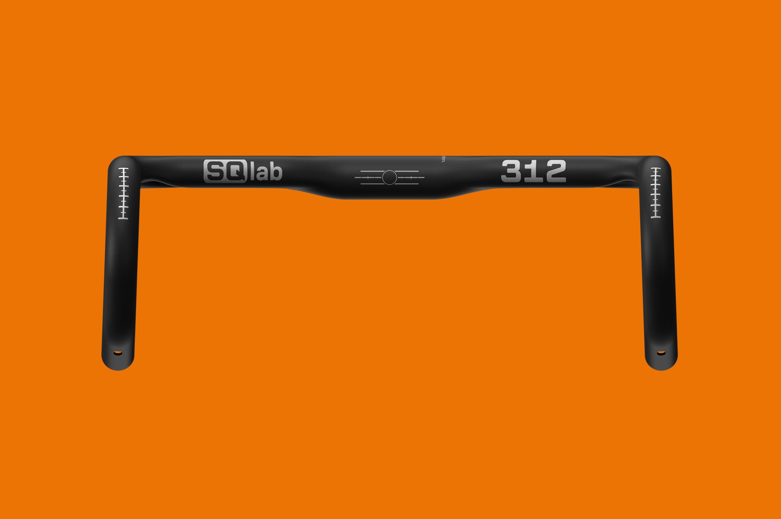
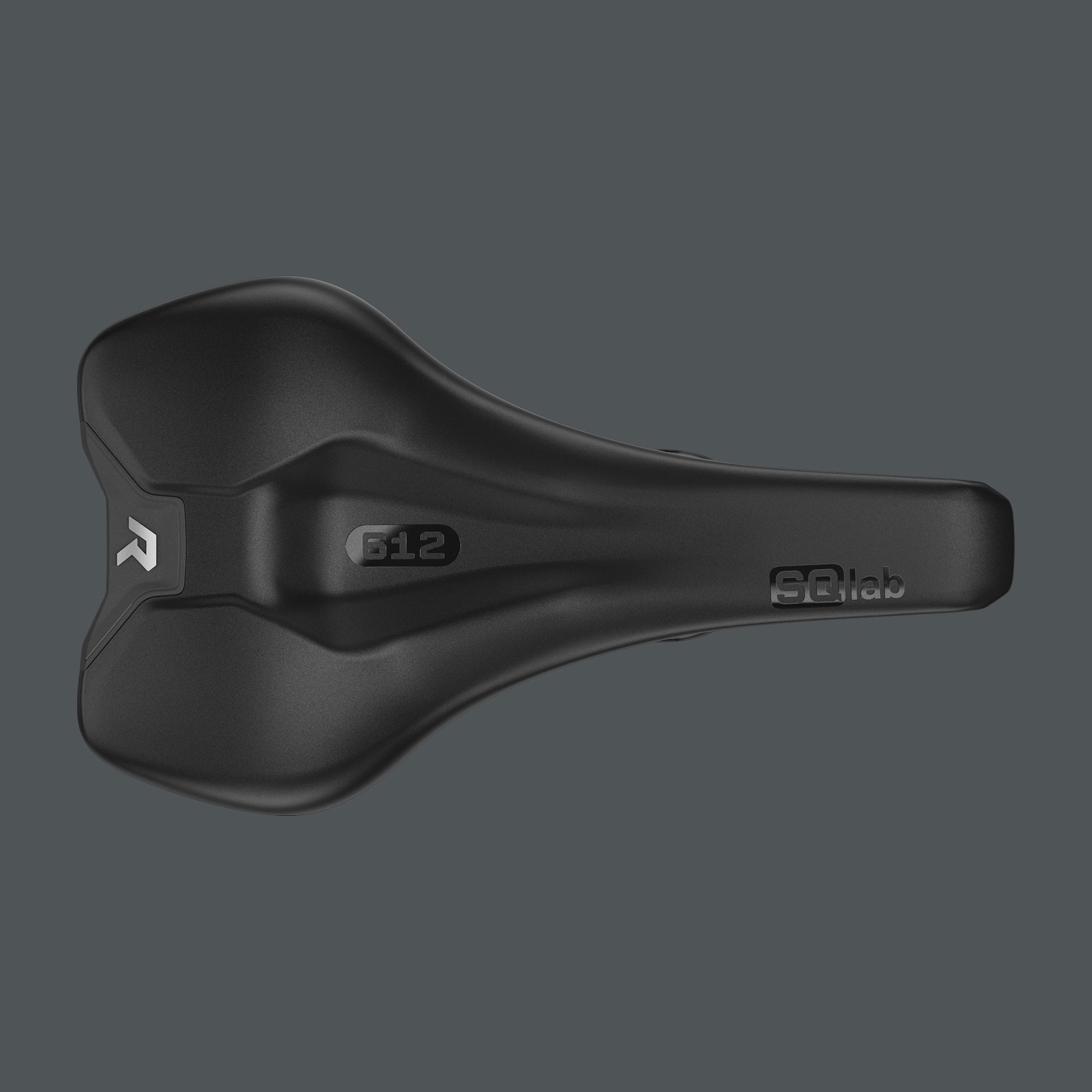
SQlab develops ergonomic bicycle components with a focus on optimizing the contact points between rider and bike. The brand is defined by precision, consistency, and measurable performance, translating biomechanical research into products that enhance comfort, control, and safety.
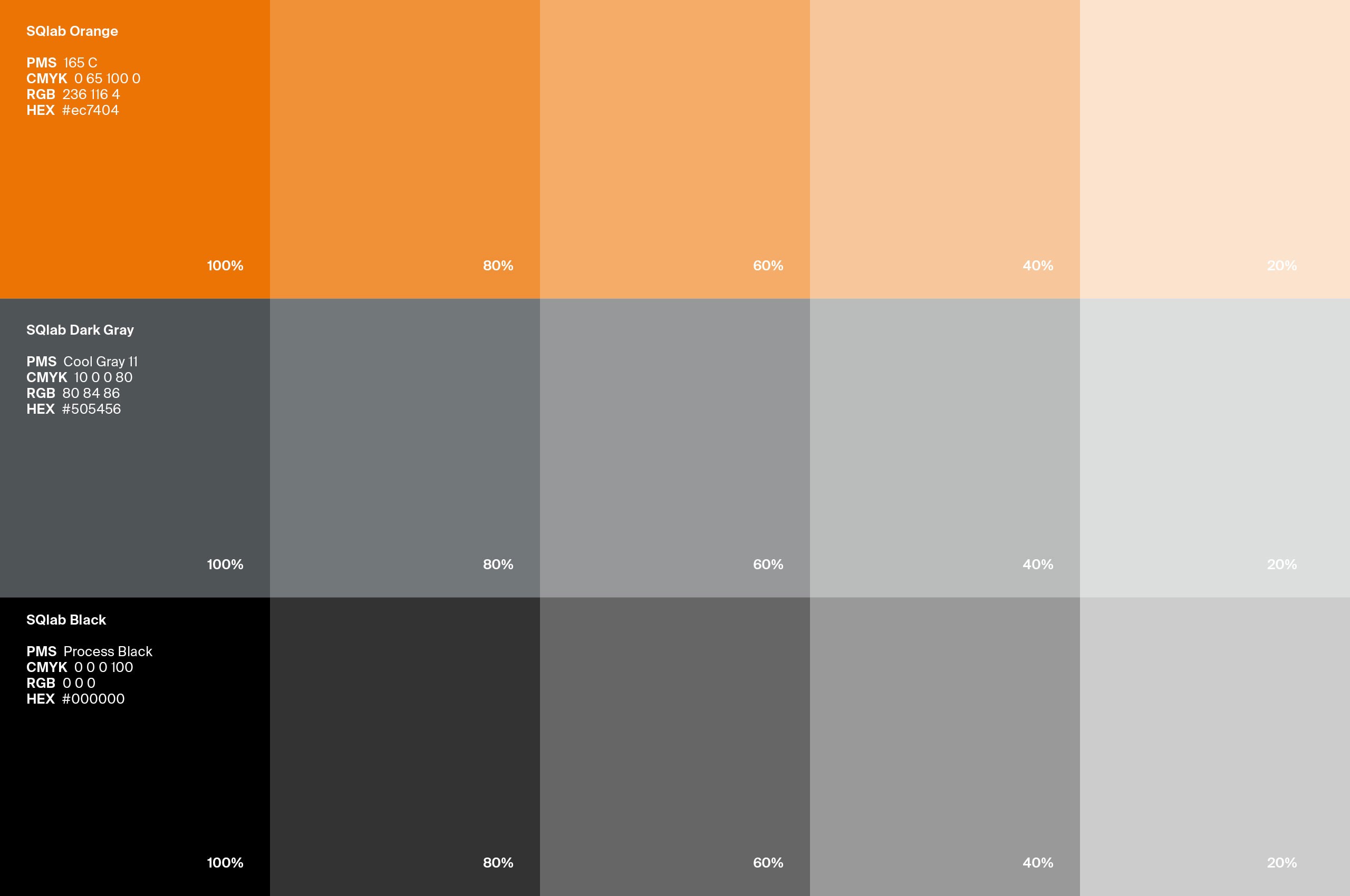
The redesign of the SQlab wordmark aimed to refine its formal balance and create a coherent visual system. The outer shape around the letters “SQ” was adjusted and harmonized with newly drawn letterforms, aligning stroke weights and proportions to achieve a controlled, stable structure. Both letters were reconstructed with optical corrections to terminals and radii, eliminating previous imbalances and giving “SQ” a clear, uniform width.
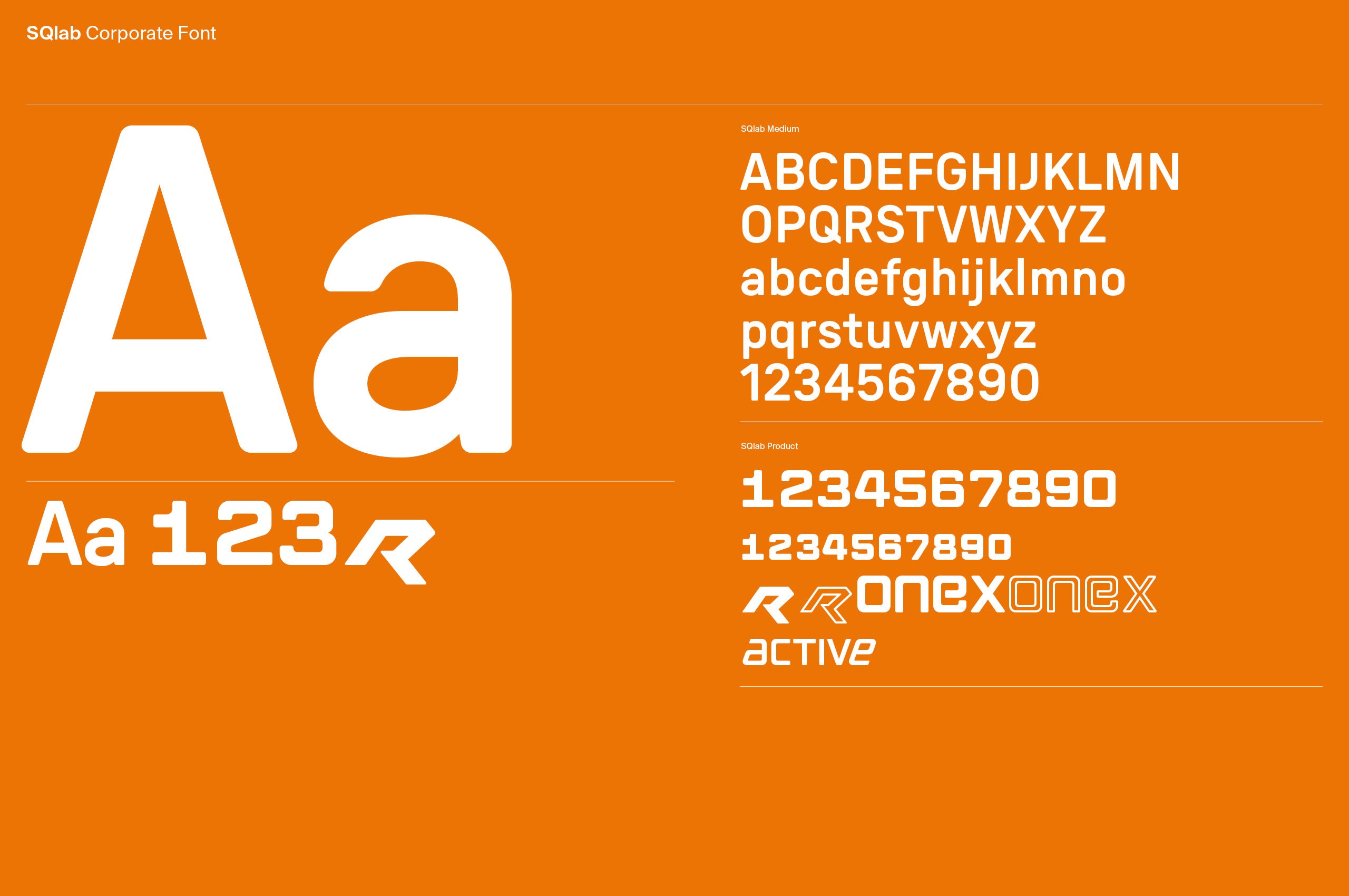
The lowercase “lab” was newly developed and styled to reflect the characteristics of the uppercase letters. Rounded corners establish a visual connection between the two elements, unifying the wordmark into a single, consistent system.
The identity was further extended through a functional typographic toolkit. A monospaced corporate product font structures all product labels, complemented by a dedicated typeface for naming extensions such as “R,” “active,” and “ONE X.”
The result is a precise and technically grounded wordmark, embedded within a coherent typographic system that ensures consistency and clarity across all brand and product applications.
SQlab develops ergonomic bicycle components with a focus on optimizing the contact points between rider and bike. The brand is defined by precision, consistency, and measurable performance, translating biomechanical research into products that enhance comfort, control, and safety.
The redesign of the SQlab wordmark aimed to refine its formal balance and create a coherent visual system. The outer shape around the letters “SQ” was adjusted and harmonized with newly drawn letterforms, aligning stroke weights and proportions to achieve a controlled, stable structure. Both letters were reconstructed with optical corrections to terminals and radii, eliminating previous imbalances and giving “SQ” a clear, uniform width.
The lowercase “lab” was newly developed and styled to reflect the characteristics of the uppercase letters. Rounded corners establish a visual connection between the two elements, unifying the wordmark into a single, consistent system.
The identity was further extended through a functional typographic toolkit. A monospaced corporate product font structures all product labels, complemented by a dedicated typeface for naming extensions such as “R,” “active,” and “ONE X.”
The result is a precise and technically grounded wordmark, embedded within a coherent typographic system that ensures consistency and clarity across all brand and product applications.


Credits
Photography
©SQlab
Credits
Photography
©SQlab